Pop Art
Warhol silkscreened the soup can; Hamilton collaged the future — the supermarket had finally become a museum.
On a July evening in 1956, at the Whitechapel Gallery in London, visitors to an exhibition called *This Is Tomorrow* encountered a small collage by a relatively unknown artist named Richard Hamilton. It showed a muscle-bound man holding a lollipop labelled 'POP', a pin-up on a sofa, a television, a tape recorder, a vacuum cleaner, a tin of ham, and a ceiling dominated by a planet-sized cinema screen. Hamilton had titled the work *Just What Is It That Makes Today's Homes So Different, So Appealing?*, and in twelve square inches of cut-and-pasted American magazine imagery he had produced the founding document of Pop Art. Across the Atlantic, the consumer economy was generating the same visual environment — advertising, packaging, celebrity, comic books — and a younger generation of New York artists was asking the same subversive question: if the supermarket and the billboard now dominated visual life more completely than any painting could, why wasn't art made from that material? Andy Warhol answered by silkscreening Campbell's soup cans and Marilyn Monroe's face in factory multiples. Roy Lichtenstein answered by scaling up newspaper comic-strip panels to museum size. The question Pop Art posed — whether commercial imagery was legitimate artistic material, and whether the line between high culture and mass culture meant anything — has never been definitively answered, but the work it produced remains among the most immediately recognisable of the twentieth century.
Origin and history
Pop Art had two simultaneous points of origin, separated by the Atlantic, and the two versions — British and American — are distinct enough to deserve separate accounts.
The British version emerged in the early 1950s from the Independent Group, a loose collection of architects, critics, painters and sculptors who gathered irregularly at the Institute of Contemporary Arts in London. Members including Hamilton, Eduardo Paolozzi, Lawrence Alloway (who would coin the term "pop art" around 1955–58) and the critic Reyner Banham were fascinated by American popular culture — not sardonically, but with genuine enthusiasm for its energy, its technological optimism, its imagery of abundance. Paolozzi's 1952 lecture at the ICA, in which he projected American magazine advertisements, science-fiction covers and packaging without comment, is often cited as the movement's unofficial British birth. Hamilton's collage of 1956 was its first fully formed artwork. British Pop artists — Peter Blake (who designed the Sgt Pepper sleeve in 1967), David Hockney in his early Royal College years, Patrick Caulfield, Allen Jones — tended toward a more reflective, even melancholy relationship with the popular imagery they used, aware of their position as observers of an American culture they consumed but had not produced.
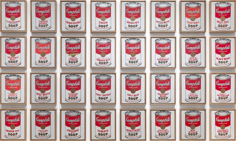
The American version emerged independently in New York in the late 1950s and early 1960s, out of two overlapping contexts. The first was the work of Jasper Johns and Robert Rauschenberg, who in the mid-1950s had already incorporated everyday objects and commercial imagery — flags, targets, newspaper photographs, Coca-Cola bottles — into works that challenged Abstract Expressionism's seriousness and its sharp division between art and non-art. The second was the commercial art world itself: Warhol had worked as a successful graphic designer and window dresser before turning to fine art, and he brought a designer's cold eye for what imagery was already optimised by mass culture. His first Campbell's Soup Cans show at the Ferus Gallery in Los Angeles in 1962, where the thirty-two canvases were displayed on a shelf like goods in a supermarket, was received with confusion that quickly converted into fascination.
The movement spread rapidly through the 1960s, fuelled by the alignment between its imagery and the decade's broader cultural revolution — television, the civil rights movement, celebrity, Vietnam War imagery, the sexual revolution. Lichtenstein's enlarged comic-strip panels, Oldenburg's soft sculptures of hamburgers and typewriters, James Rosenquist's billboard-scale montages and Warhol's Factory productions of films, records, happenings and prints all fed a decade that was itself beginning to question the distinction between culture and its commercial reproduction.
Concept and philosophy
What Pop Art proposed — and what made it so disruptive in the context of the early 1960s art world — was that the imagery already saturating everyday life was not debased raw material awaiting artistic transformation but was itself already significant. This sounds obvious today, when the distinction between high and popular culture is so routinely blurred as to be nearly meaningless. In 1962, it was a provocation.
Abstract Expressionism had placed the highest possible value on individual gesture, unconscious authenticity, and the heroic isolation of the artist. Warhol's response was systematic and almost clinical in its precision: he eliminated the gesture by using silkscreens; he eliminated the individual hand by hiring assistants in a studio he pointedly called the Factory; he eliminated the mystique of the unique object by producing works in series. The Campbell's soup can, repeated across thirty-two canvases in identical format, asked: if an image is reproduced enough times, does it accumulate meaning or lose it? Or does repetition itself become the meaning?
For Lichtenstein, the target was the language of commercial printing itself — the Ben-Day dot grid that newspaper comics used to create colours and tones at speed and at low cost. By enlarging that grid to monumental scale, he made visible a mechanical process that the eye normally glosses over. His paintings look like comics but function as formal investigations of how mass-produced imagery works — how it simplifies, standardises, sentimentalises, and makes everything it touches interchangeable. The emotional flatness is the point, not a failure.
British Pop, especially in Hamilton's theoretical formulations, was interested in something slightly different: the sociology of the consumer object. Hamilton's famous list of qualities he wanted in a Pop work — "Popular, transient, expendable, low-cost, mass-produced, young, witty, sexy, gimmicky, glamorous, and Big Business" — reads less like an aesthetic programme than a cultural diagnostic. Pop Art, in this British version, was not celebrating consumer culture so much as anatomising it with the detachment of an anthropologist examining the artefacts of a newly discovered civilisation.
How to recognise it
Six visual hallmarks that identify Pop Art across both its British and American variants — from Hamilton's collaged interiors to Lichtenstein's Ben-Day dots and Warhol's serial silkscreens.
- Commercial imagery as subject — Brand logos, consumer products, advertising photography, comic-strip panels, newspaper photographs of celebrities — these are not backgrounds or references but the literal subject matter of Pop Art. If the painting depicts something you could find in a supermarket, a magazine or a cinema foyer, you are on Pop Art territory.
- Flat, hard-edged colour — Pop Art deliberately rejects the modelling, shading and tonal gradation that traditional painting used to create the illusion of three-dimensional space. Flat, unmodulated areas of colour with clean, graphic outlines produce a surface that looks printed rather than painted — and that resemblance to print is entirely intentional.
- Ben-Day dots — Lichtenstein's most instantly recognisable technique: regular grids of uniform dots — the mechanical colour-separation method used in newspaper and comic-book printing — applied at a scale where the dots become visible as dots rather than blending into a tone. Standing close to a Lichtenstein is like looking at a newspaper under a magnifying glass; stepping back produces the colour field the dots are designed to generate.
- Photographic silkscreen — Warhol's technique: a photographic image transferred to a silk screen and applied to canvas, often with deliberate misregistration, streaking, or colour applied in non-naturalistic combinations. Marilyn Monroe's lips in acid green, her skin in pale lavender — the mechanical process and the wilful wrongness of the colour are both part of the meaning.
- Serial repetition — Repetition as a compositional strategy — the same image reproduced across a grid, the same face printed in twenty-five colour variations, the same soup can on thirty-two canvases — enacts the logic of mass production rather than merely depicting it. If a painting seems to be multiply the same thing, you are in Pop territory.
- Deliberately impersonal surface — Pop Art aggressively suppresses the evidence of the individual hand — no visible brushwork, no gestural variation, no expressive impasto. The surface is smooth, graphic, reproducible-looking, the exact opposite of Abstract Expressionism's tortured, individual marks. This impersonality is not a failure of craft but a carefully constructed position.
Anecdotes and curiosities
Warhol instructed his assistants to make the silkscreens slightly wrong. The Campbell's soup cans and celebrity portraits produced at the Factory were not the result of mechanical precision but of deliberate controlled imprecision: registration was allowed to slip, ink application was uneven, the same photographic source was recoloured in arbitrary combinations from session to session. Warhol understood that perfect mechanical reproduction would look boring, while slight misalignment — the ghost of the process showing through — would look interesting. He also employed a rotating cast of assistants, friends and hangers-on to do much of the physical work, further confusing the question of where the art ended and the social performance began. When collectors asked him directly which works were the most valuable, he reportedly told them to buy the ones with the most mistakes.
Richard Hamilton spent two years on a painting of the Guggenheim Museum's interior. *Interior II* (1964), which combines a photographed interior with collaged figures from advertising, took Hamilton far longer than any commercial commission would have allowed, and the result is one of the most carefully constructed paintings in the British Pop canon. Hamilton was unusual among Pop artists in treating each work as a sustained intellectual problem: his output was small (by Warhol's factory standards, minuscule) and each piece was preceded by extensive research into the visual culture from which it drew. He remained suspicious of the movement's American branch and wrote critically about Warhol's willingness to commodify everything, including the critique of commodification.
Roy Lichtenstein was accused of stealing his images directly from comic-book artists. The comic-strip panels that Lichtenstein enlarged and exhibited in the early 1960s were adapted — sometimes quite closely — from existing published comics by artists including Russ Heath and Irv Novick, who received neither credit nor compensation. The ethical and legal questions raised by this appropriation were never fully resolved during Lichtenstein's lifetime: he consistently described his process as one of transformation rather than copying, arguing that his changes in scale, colour and framing constituted an original artistic act. The debate about appropriation, authorship and the ethics of popular culture that his work provoked became one of the central conversations of late-twentieth-century art.
David Hockney's first American swimming pool was based on a photograph from a brochure. When Hockney moved from London to Los Angeles in 1964, he was struck by the Californian swimming pools he saw — especially the play of light on moving water, which he had never painted before. *A Bigger Splash* (1967) and the series of pool paintings that preceded and followed it were developed partly from photographs, partly from direct observation, and partly from the conventions of advertising imagery. The chrome and aquamarine palette, the graphic clarity, the barely-there splash — the result of weeks of careful construction — place the work at the intersection of Pop Art, realism and something else entirely, which is partly why Hockney resists easy categorisation and yet sits most comfortably here.
Legacy and influence
Pop Art accomplished something that seemed paradoxical at the time and still feels slightly vertiginous: it made the dissolution of the boundary between high and low culture into a permanent condition of the art world. Before Pop, the separation of fine art from commercial imagery was an article of faith; museums and galleries were precisely the spaces where commercial visual noise was excluded. Warhol's work did not just question this boundary; it made the question unanswerable. Once you have hung a soup can in a museum and invited serious critical attention, you cannot un-ring that bell. Every subsequent art form — Neo-Expressionism, Neo-Geo, Young British Artists, street art — has operated in a world where that boundary is known to be porous. More concretely, Pop Art's visual grammar has colonised advertising, fashion, graphic design and digital culture with such thoroughness that the influence is now invisible — we see in Pop categories without knowing we are doing it. Warhol's prediction that everyone would be famous for fifteen minutes was, among other things, a precise description of social media thirty years before its invention. And Hamilton's list of Pop qualities — "popular, transient, expendable, low-cost, mass-produced, young" — reads today as a specification for the internet.
4 artists in this movement
Frequently asked questions
Did Pop Art start in Britain or America?
Both simultaneously and independently. The British strand emerged from the Independent Group at the Institute of Contemporary Arts in London in the early 1950s — Eduardo Paolozzi's 1952 lecture and Richard Hamilton's 1956 collage are its founding moments. The American strand developed independently in New York from around 1958, growing out of the work of Jasper Johns and Robert Rauschenberg and crystallising with Warhol, Lichtenstein and Oldenburg in the early 1960s. The British version was more reflective and sociologically oriented; the American version larger in scale, more commercially confident, and ultimately more internationally dominant.
What is the difference between Pop Art and Surrealism?
Both movements used imagery of everyday objects in unexpected contexts, but their aims were opposite. Surrealism displaced familiar objects (fur-lined teacups, melting watches) to access the unconscious — the irrational, the dreamlike, the repressed. Pop Art kept familiar objects (soup cans, comic strips) recognisably themselves and placed them in the context of fine art to question the social category of art — to ask what made one kind of visual image valuable and another disposable. Surrealism looked inward; Pop looked outward at the social production of images and desire.
Why did Warhol want to be a machine?
Warhol's famous statement — "I want to be a machine" — was a rebuke to Abstract Expressionism's cult of individual genius and unconscious authenticity. If the AbEx painters claimed that the unique, gestural mark was the index of a unique, suffering self, Warhol proposed the opposite: that the serial, mechanical, interchangeable image was more honest about what modern life actually was. By using silkscreens, hiring assistants and naming his studio the Factory, he deliberately stripped his work of the signs of individual authorship. Whether this was nihilism, critique or simply brilliant marketing has been argued about ever since.
Who are the most important Pop Art artists?
From the British strand: Richard Hamilton (1922–2011), Eduardo Paolozzi (1924–2005), Peter Blake (b.1932), David Hockney (b.1937) and Patrick Caulfield (1936–2005). From the American strand: Andy Warhol (1928–87), Roy Lichtenstein (1923–97), Jasper Johns (b.1930), Robert Rauschenberg (1925–2008), Claes Oldenburg (1929–2022) and James Rosenquist (1933–2017). Rauschenberg and Johns are technically pre-Pop but are almost always treated as its necessary preconditions.
Is Pop Art ironic or sincere?
This question was argued about fiercely at the time and remains unresolved. Warhol consistently refused to say — his public persona of affectless blankness was partly designed to make the question unanswerable. Hamilton's theoretical writing suggests genuine critical interest in consumer culture rather than simple celebration. Lichtenstein insisted he was investigating the formal properties of commercial imagery, not endorsing its values. The most honest answer is probably that Pop Art contains both sincere fascination and critical distance simultaneously, and that the tension between them is where its energy comes from — which is precisely what makes it difficult to dismiss as mere celebration of capitalism and equally difficult to read as pure critique.